#MakeoverMonday challenges its community every week to visualize a new set of data. The challenge is meant to help create more effective data visualizations so the information can be more easily understood.
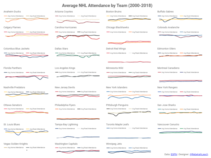
For the first week of 2019, the challenge was to make this visualization on NHL game attendance better. Here’s what I came up:
What Did I Change?
In the original data visualization, there was too much information packed into a single chart. Instead of one chart for all of the data, I divided the data up by team so that it could be more easily digested.
I took it one step further by comparing home and road attendance for each team. To further distinguish the data for each team, I used colors from the teams’ logos for my charts.
Do you need help setting up reporting for your business in Data Studio? I can help! Take a moment to fill out my contact form and I will follow up with you about your project.
