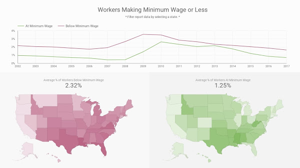
This week, the #MakeoverMonday challenge gave a set of minimum wage data from the Bureau of Labor Statics. Specifically, the data focused on the % of workers that were paid at or below the federal minimum wage.
There wasn’t anything inherently wrong about the initial data visualization, but I felt it could benefit from an interactive element. Because of this, I added additional filters to my version so that by clicking on a state, the user would be able to filter all the data included in the dashboard.
Color Choices
I chose Dollar Bill Green for this dashboard since wages = money. Dollar Bill Green was used on the data for workers being paid at minimum wage.
It is wrong to pay workers less than minimum wage and I wanted to highlight this through my color choice again. I wanted to use red, but it needed to match the shade of green already in use. To do this, I chose one of the colors from Dollar Bill Green’s triadic color scheme.
This allowed me to use two contrasting, yet complimentary colors in my interactive data visualization. What do you think of my color choices? Let me know in the comments below!
If you need help creating an interactive dashboard in Data Studio, let me know.
