I know it’s been a while since my last #MakeoverMonday post, but I’ve been distracted with my new pupper. He’s still not a fan of my using my laptop over giving him pets, but he gave me a break today so I could take a crack at this week’s data set.
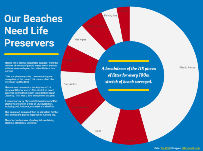
At work this week, I tried using a pie chart on a data set on a whim and it ended up being exactly what I needed to visualize the data for that particular POC. That success inspired the design for this visualization.
The colors for the pie chart were chosen to resemble a life preserver. The blue background was chosen to emulate the water that is being affected by the beach waste measured in the report.
I do my best to recycle and not use unnecessary plastics (straws, grocery bags, etc.). After reviewing the article this week’s challenge was based on, I’ve recommitted myself to be a better steward of this earth. I hope this visualization will help encourage others to do the same.
