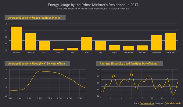
I’m a few weeks behind on #MakeoverMonday because I adopted the most adorable dog, Kobuk. He thinks my hands should be reserved for petting him and has a tendency to paw at them when I try to type so I had to put this together while he napped on the other side of the couch.
Before I started working with this data set, my only knowledge of 10 Downing Street came from the movie Love Actually. Number 10 is where Hugh Grant’s character, David, meets and falls in love with Natalia, a new member of his staff (Martine McCutcheon).
The movie has very little to do with my graph, but did inspire the use of a dark background to mimic the color of the building. I chose yellow as my primary color since electricity is most commonly associated with lights. Also, the yellow popped on the black background.
A variety of factors affects the amount of electricity used (weather, day of the week, holidays, etc.) which is why I focused on the average electricity usage to get a more complete overview of the data. What do you think about how I chose to display the data?
